Wednesday, August 26, 2020

Friday, March 6, 2020

Cat Snack


I found this comic from four years ago while flipping through my sketch book.

Tuesday, March 3, 2020

Logo: BEAR MOUNTAIN PADDLE RACE


I designed this logo for HVH2O's first paddle race. (The plan is to have it printed on T-shirts.) The initial idea was to show a bear on a paddle board with Bear Mountain in the background. I didn't think that alone would work, so I played around with adding an outline of Puerto Rico. Then someone really wanted the Bear Mountain Bridge as part of the design, so that ended up replacing the mountain. The bridge is much more iconic anyway.

HVH2O is hosting this race as a fundraiser for Salon Angelitos de Amor, Inc., an organization that works to help improve the lives of children with Down’s syndrome in Puerto Rico, which was affected by the recent natural disasters. One of my husband's friends came up with this idea for the race, when a paddle race he had signed up for that was being held in Puerto Rico to raise funds for Salon Angelitos de Amor was cancelled due to the ongoing bad conditions in Puerto Rico. He still wanted to raise funds, so he approached HVH2O with a plan for the race.

Saturday, February 29, 2020

Illumination: DANCING FOXES

Earlier this month, I went to an SCA event called "At the Sign of the Dancing Fox." To raise money for the event, a silent auction was held. This event is one of my favorite SCA events to go to. There is live medieval music played on period instruments, dancing, and a dressing the fox competition. (Contestants purchase a small plush fox or other animal, and sew garb for their animal and write up a story about it.) With that in mind, my contribution to the silent auction just had to be an illumination of some garbed dancing foxes with another garbed fox playing music. At least these dancers actually look like they are dancing, but it's still nice to have a musician nearby.

First I made this sketch of foxes dancing. Because I wasn't striving for authenticity, I sketched it out at a size larger than I planned on the final being, and then scanned it. I cleaned up a few things, printed it out to size (5.5 in. x 3.5 in), and taped it to a light box.

I taped a piece of hot press bristol board down over the printed sketch and carefully traced the sketch, and then inked. The final art was painted with gouache and water color. 

To properly get the feeling of medieval dancing, I referred to these images:

from the Missel de Montierneuf - BNF Latin873 f21

Marginalia from the Romance of Alexander MS Bodleian 264, France c. 1338-44f

Here is the final illumination, ready to go to "At the Sign of the Dancing Fox." Apparently, there had been a bidding war for it, and I have no idea who ended up winning the bid, as I had stepped out of the room at the moment the winning bid was being announced.


Illumination: PAGE FROM THE MANESISCHE LIEDERHANDSCHRIFT


This is a recreation of an illumination from the Codex Manesse, also know as the Manessische Liederhandschrift. This piece was my entry into the St. Eligius Arts & Sciences Competition of a local chapter of the SCA. I entered in the Novice level of the Paper & Ink Category. I had decided to recreate this particular image because it was very similar to  a framed print of an image from the Codex Manesse in that my parents had when I was growing up, and I always liked the style of the art. I ended up winning in two categories: the overall Novice category and the overall Paper & Ink category. 


This was very different from anything I would normally do because I was attempting to copy the original as closely as possible. The pencil and ink drawings were all done on the same paper that finished gouache painting was going to be done on. No scanning the sketch and moving things around in Photoshop. Whatever I inked was going to stay that way. Below are the pencil sketch and the ink sketch, both of which I documented before going to the next step.

Here is what the original illumination looks like:
Der Schenk von Limpburg, Codex Manesse.
Universitätsbibliothek Heidelberg, Cod. Pal. germ. 848, Bl. 082v,
 Große Heidelberger Liederhandschrift, Zürich c. 1300-1340 

I ended up framing the illumination and giving it to my father for Christmas. It's now hanging in his house with two framed prints of two other pages from the Codex Manesse.


Illumination: SCA AWARD SCROLL


Back in the summer of 2018, my family and I joined the Society for Creative Anachronism, a medieval reenactment group. In the SCA, members can choose to pursue many of the arts and sciences of the middle chooses. I decided to try my hand at illumination, which really wasn't all that much of a stretch from how I personally like to work. One of the things that illuminators in the SCA do is to create art for the various scrolls that are awarded to members for a wide range of things. I was asked to create this particular scroll that was being awarded to a friend of mine. She was being granted the Order of the Green Lantern in acknowledgement of her skill, sharing and teaching of medieval dance, embroidery and games. My only requirement was to include the heraldic device of the Order, which happens to be a silver lantern set on a background of a green star. Later, I passed the scroll on to another person for the calligraphy to be added.

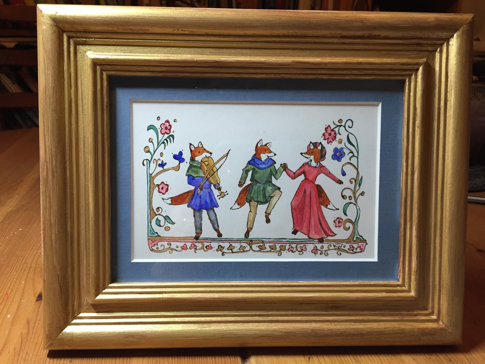
I decided to incorporate images showing all of the activities she had taught to others. She is primarily known for her skill and love of dance, so the main image at the top shows a group of medieval dancers. Since medieval dances in art often look like a bunch of people just standing around, they need to show two musicians to convey that this is dancing, and not just people standing around. The illuminated letter B shows my friend in the middle of embroidering something (I referred to a photograph for that!), and the marginalia at the bottom is supposed to be the award recipient and her husband playing a game of Nine Man Morris.

I had to do a lot of image research to pull this off. Following are several images that I referred to in the process of sketching out this scroll.  The below image is the one I referred to for the basic layout of the page.

From the Romance of Alexander, MS Bodleian 264, France c. 1338-44
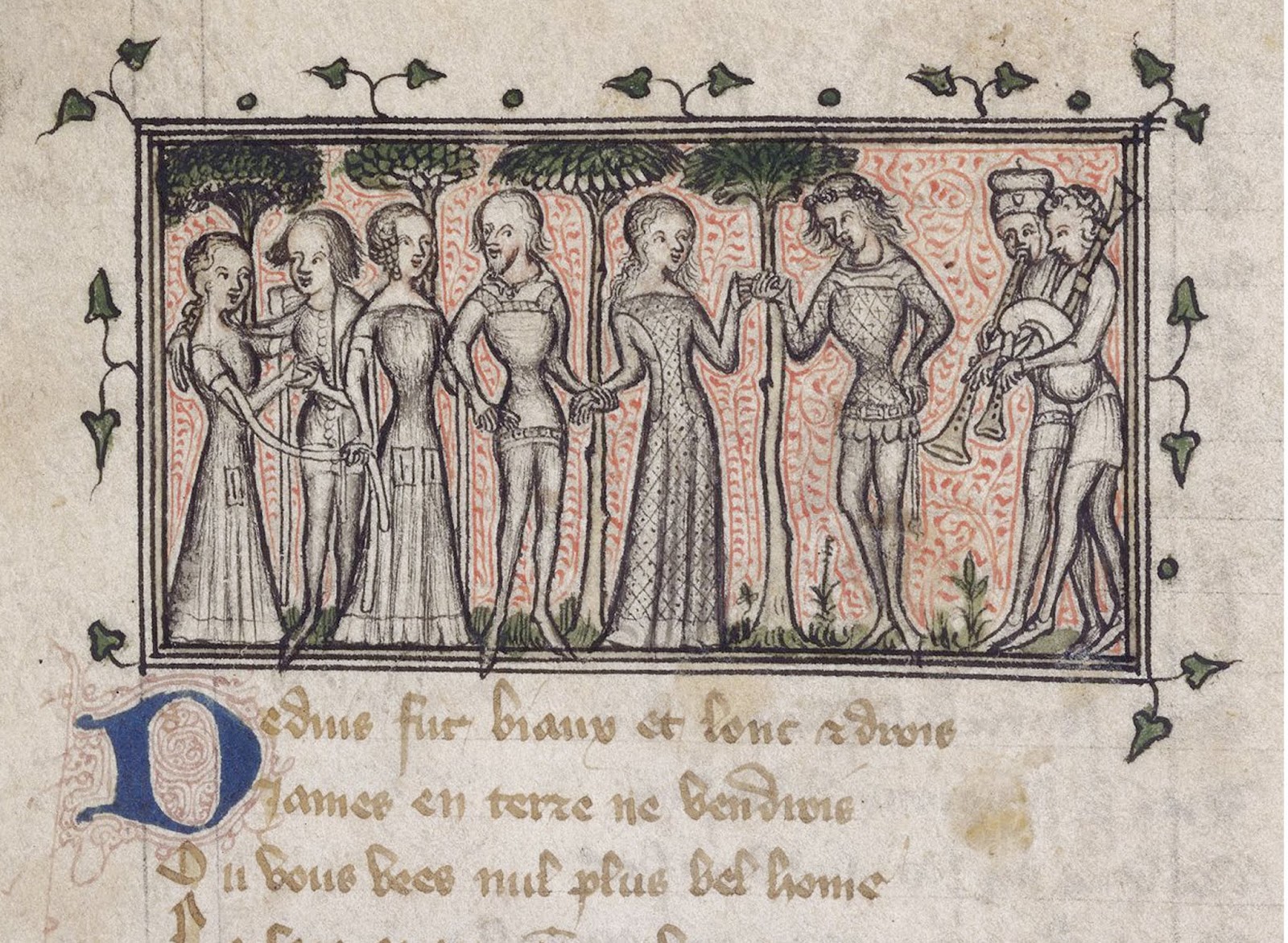
For the main image, I referred to this group of dancer from the Roman de la Rose. Notice how the dancers all look like a bunch of people just standing around holding hands? Thank goodness the shawm player and bagpiper are there to clarify things.

"Mirth and Gladness" from the Roman de la Rose, Yates Thompson 21, f. 8v, France c. 1380

The marginalia of many medieval manuscripts contain all kinds of images from everyday life and the Romance of Alexander is no exception. There, I found many instances of couples playing medieval board games, so I was able to find reference for the Nine Man Morris playing couple figured at the bottom of the scroll.
From the Romance of Alexander, MS Bodleian 264, France c. 1338-44


HVH2O: Costume Paddle


I was asked to create an illustration for a poster advertising HVH2O's Costume Paddle event. Entrants were encouraged to come in costume and/or decorate their paddle boards, kayaks and canoes. I had a lot of fun doing this, especially the visual research into other such events. Much to amusement, I saw that people really did paddle in their T-Rex costumes, so of course I had to add one to my illustration. 

Below is the final design of the poster.


HVH2O: Sea Shanty Jamboree


In 2019, HVH2O held a Sea Shanty Jamboree fundraiser. For the postcard advertising the event, I was asked to create an image showing the Half Moon on the Hudson River, passing by Bear Mountain. I was asked to show some paddlers alongside the ship. If you look closely, there is also a swimmer next to the paddleboarder. A giant sturgeon is leaping out of the water behind them.

Below is the postcard. The postcard was designed by Taryn Murphy.


HVH2O: Site Rendering


Along with two of his friends, my husband recently founded HVH2O, a paddle sports and environmental education non-profit organization. HVH2O stands for Hudson Valley Water (aka the Hudson River). He asked me to create an image that shows a visualization of what a permanent site for the organization could look like at the Peekskill Landing Park. The large structure at the right are kayak and storage lockers, along with a changing room, that HVH2O hopes to get funded through a grant. A previous version of this image didn't show the storage lockers, nor the logo. I patched those in recently. 

To create this, I made a pencil drawing that I scanned, printed out on watercolor paper, and then painted with watercolor. 


Here is what the early version of the HVH2O paddle sports center rendering looked like. Can you spot the differences?

Sketch: JOB HUNT


Play Poster: THE SEUSSIFICATION OF ROMEO AND JULIET


In 2017, the eighth grade play at the school where my husband was teaching at the time was a production of The Seussification of Romeo and Juliet. He had seen a performance of this play at another school and thought it would be perfect for his students that year. For me, this meant that the poster was going to be done in the style of Dr. Seuss. Layout-wise, it was the most challenging because I needed to get all the components of the illustration to work with the text that was to go on the poster. 


Instead of creating one single illustration, I first sketched out the the background. Then I sketched out  Romeo, Juliet, and two Barbaloots without any regard to scale. Drawing characters in a Dr. Seuss style is not natural for me, so it was easier to just draw them at any size, with the plan of resizing them in Photoshop.

The next step was to incorporate the characters into the background, resizing them to fit the space.


After that, I placed the sketch into the layout, resized it, and moved around parts of the art in to work with the type. Once that was done, I printed out the image and did an ink drawing over it on layout bond paper.
 This is the inked drawing that I scanned and colored in Photoshop. This poster ended up being the last one I did for that school. The curriculum for the classes my husband taught changed the following school year, and he was no longer able to put on plays with his students. He ended up moving on to another school district after that.


Political Parody


It wasn't long after the Inauguration of the 45th president when I was working on the the poster for Camp Fear and A Full Team, and while I was adding color to the art, the idea for a political cartoon version of the same poster came to me. So here we have the same group of young people, who are now in more symbolic clothing, literally running for their lives from what has become a not so pleasant reality. (The girl with the pink tights is wearing a T-shirt that bears the design of a T-shirt that a friend of mine designed and sold through her company Squirrel Den Studio.) That sinister creature in the tent most definitely ate the dog, so tie-dye shirt dude is utterly beside himself. 

Play Poster: CAMP FEAR


2017's sixth grade play at the school where my husband was teaching at the time was really production of two plays he had written. Camp Fear is about a group of kids at a summer camp who discover a ghost in a shipwreck that they find nearby. A Full Team is about a soccer team at a small school that doesn't have enough players for a team, so they find they have to recruit new players from unlikely sources, like the chess club. The storyline of Camp Fear immediately brought to mind Scooby Doo, so I designed the poster to have the look of a Scooby Doo comic book cover. To create one unified image, I cast the kids from the soccer team in A Full Team as the campers in Camp Fear. Unfortunately, there was no dog sidekick. I think the creature in the tent may have gotten him.


This pencil sketch became the basis of the art in the poster. The color was added in Photoshop, with the sketch as the top layer set on multiply. I like doing this, because then the art can maintain the looseness of the sketch. 

In the play, A Full Team, the actors all needed T-shirts with the soccer team's logo on it. This is what I came up with. The sketch was used as a template in Illustrator, which I used to create the logo. The logo was printed out on iron-on decals, and were then heat-transferred to T-shirts. The logo makes it onto the shirts of the kids in the poster. I changed the design for the girl in the pink tights, because she is the girl from the swim team who was recruited to play on the soccer, so her shirt reflects that.


Play Poster: THE MURDER MYSTERY AT THE MURDER MYSTERY


The 2015 sixth grade play at the school where my husband was teaching at the time was a production of a play by Brian D. Taylor called The Murder Mystery at the Murder Mystery. As you can well imagine, an actual murder happens during the production of murder mystery play and the cast has to solve who did it. Normally, my husband would write the plays the sixth graders performed based on ideas the students suggested. That year, the students wanted to perform an already existing play and this play was available through the Pioneer Drama Service. I loved designing and illustrating this poster. It's still one of my favorites. I used to watch the PBS series Mystery  with my parents and always loved the Edward Gorey animation sequence at the beginning of the program, so it wasn't much of a leap to design an Edward Gorey inspired poster. 


My first step in creating the illustration was to do a very rough sketch with the text already layed out. I find it easier to draw around an already existing text design than trying to design around an already existing drawing.


The next step was this pen and ink drawing. I had a number of Edward Gorey books spread out around my work space so I could mimic the way he handled the pen and ink, as well as the clothing design. Then I scanned the art, and added color to it in photoshop. The drawing was the top layer set on "multiply" so all the white became transparent and all the color layers underneath could be visible.

I had forgotten to add the playwright's credit to the poster so I made sure to add it to the program cover. The programs were always photocopied so all designs had to work in black and white. This one was easy: all I did was use the ink drawing for the art.


Play Poster: MUCH ADO ABOUT NOTHING


2016's eighth grade play at the school where my husband was teaching at the time was a production of Much Ado About Nothing set in the 1950s, complete with swing dancing choreographed by a dancer and dance teacher my husband is friends with. My goal was to have a poster that showed all the fun colors of 50s fashions and the movement of swing dancing.


Normally, I sketch out posters by hand, but in this case, I was in such a time crunch that I composed the layout of the poster with the reference images I was going to use. I then sketched it out quickly so I would have a template for when I created the art using Illustrator. Much to my surprise, many people loved this poster. I was surprised because it's not one of my favorites.

I'M BACK.

After a long hiatus (5 years!) of not posting to this blog, I am back. Life and work just took over. It became easier to just make a quick post of an image to my personal social media page but that really doesn't reach people beyond those in my social media friend circle. Happily, my blogger site didn't vanish from the internet! Following this post will be posts of all the images that should've been posted over the course of the past 5 years.